Editorial Spreads
TYPOGRAPHY
PUBLICATION
Project Context
How can grids and typography be manipulated to effectively communicate messages and themes within a design?
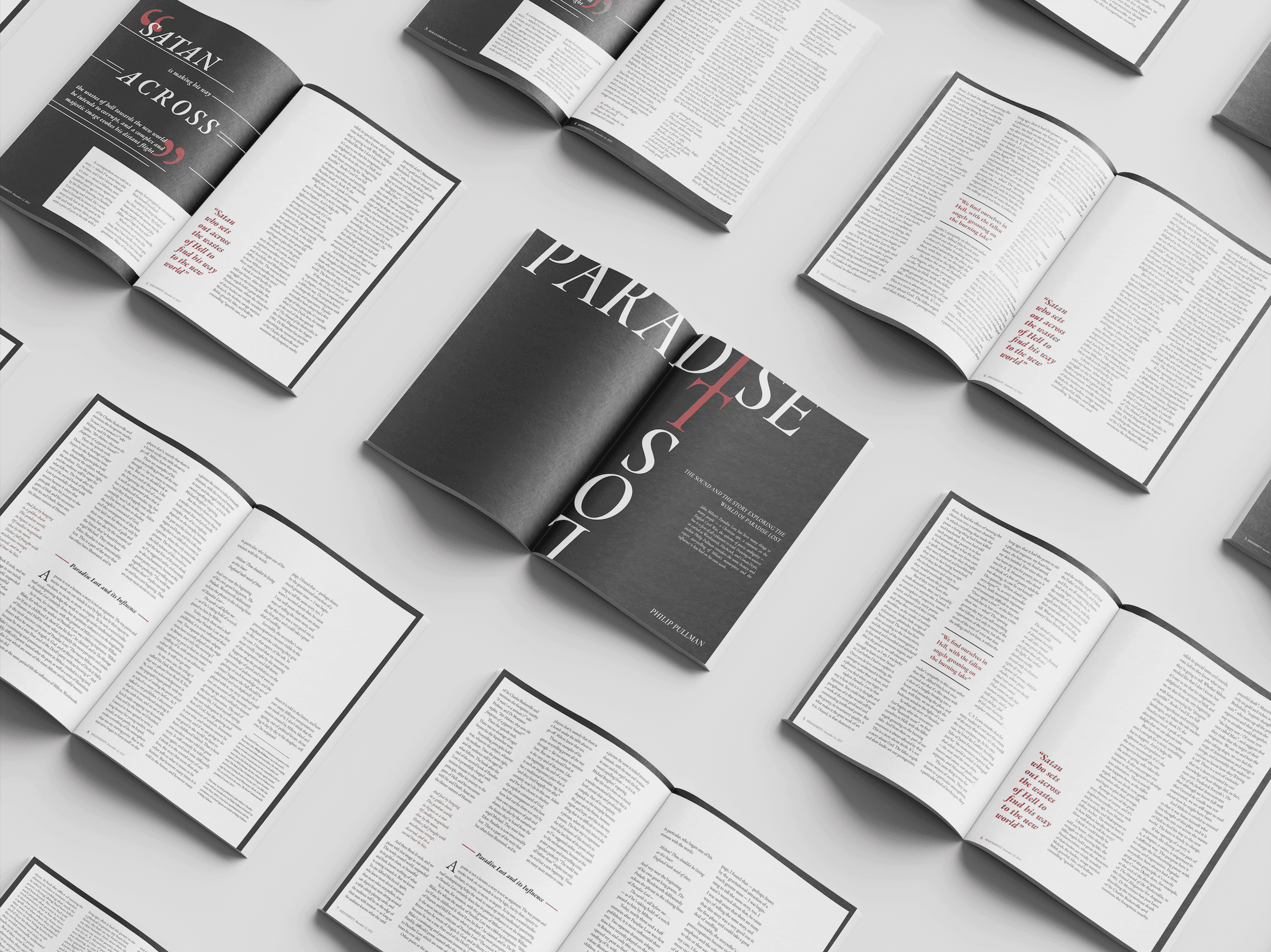
This project intended to strategically design an editorial spread using structured grids to thoughtfully convey the themes of the poem, Paradise Lost by John Milton. With a focus on exclusively typography and colour, I aimed to express these concepts through a minimalist and classical visual approach.
Design Challenge
How can a spread be strategically designed using a consistent grid system, while ensuring that the typography and layouts resemble the themes of the article?
TIMELINE
November 2022
TOOLS
PARTICIPANTS
InDesign, Photoshop
Individual
ROLE
Visual Designer
The Solution
Bold
KEYWORD
Classical
APPROACH
Minimal
THEME
Got Ideas? Let's Talk
2025 Salma Jan. All Rights Reserved
For this editorial spread, I intended to reflect the classical undertones of Paradise Lost by incorporating a minimalist visual approach that echoes its thematic structure. I utilized a grid system that prioritized the text’s form, reducing visual distractions to create a sense of balance and clarity. As a result, colour was strategically reserved, and used to highlight focal points within the layout to guide the viewer's attention. The use of a serif typeface and narrower margins were to enhance the academic and classical essence of the text, emphasizing its timeless nature.