Grain of Change
BRAND IDENTITY
PACKAGING
TIMELINE
January 2024
TOOLS
Illustrator, Photoshop
PARTICIPANTS
Individual
ROLE
Illustrator, Visual Designer
Project Context
With design readily evolving, what proactive initiatives must brands take to remain relevant in competitive waters?
Embarking on this project, with key inquiries in mind, challenged me to reimagine Kellogg’s Nutri-Grain – an established brand – by primarily leveraging an illustrative approach to communicate and revitalize a youthful, modern aesthetic, all while aligning with the desired target demographic.
Design Challenge
How can I refine an existing design by integrating an illustrative approach to enhance its modernity and visual appeal?
The Solution


Got Ideas? Let's Talk
2025 Salma Jan. All Rights Reserved
THEME
Playful
APPROACH
Organic and Fluid
KEYWORD
Friendly

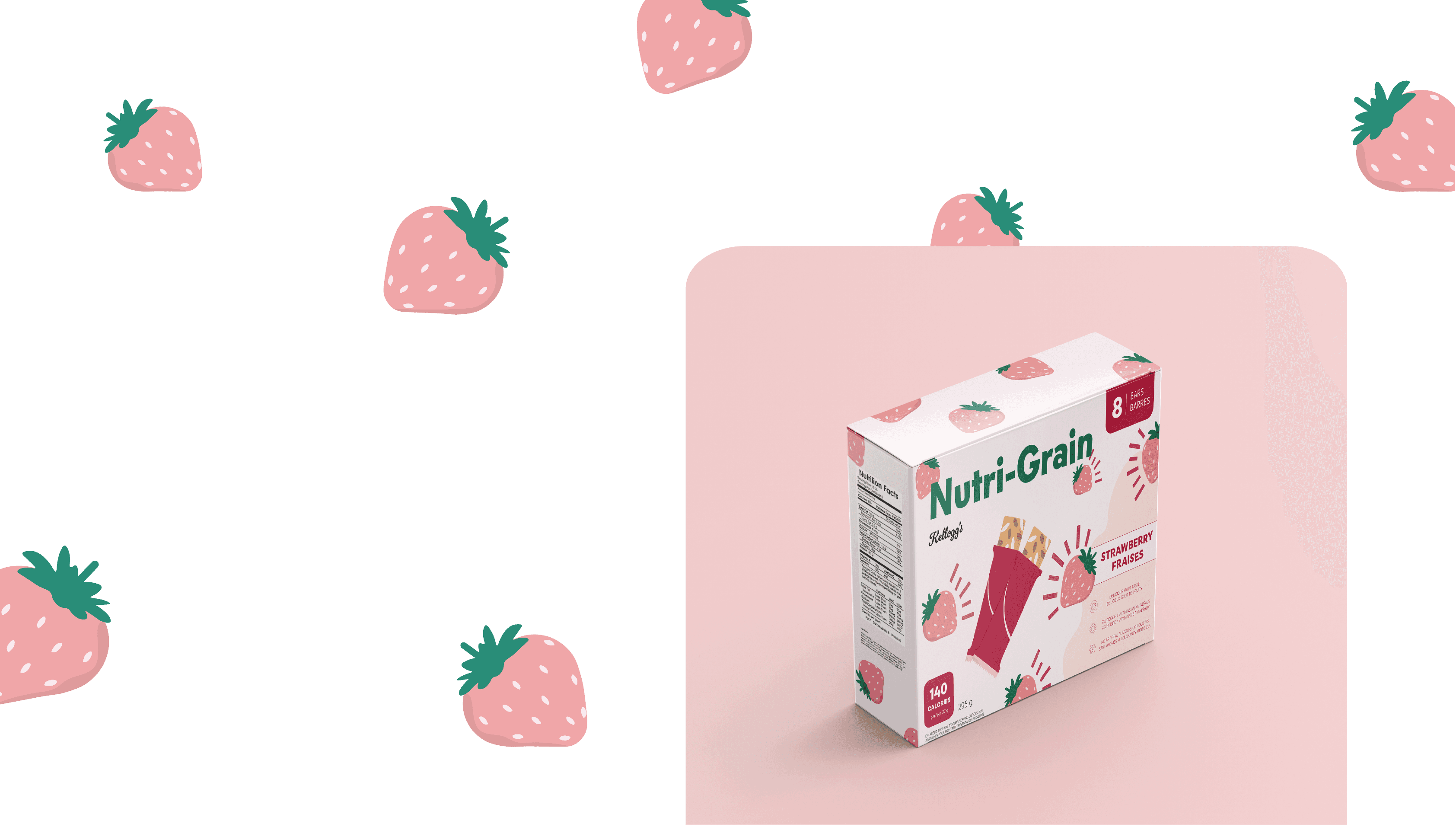
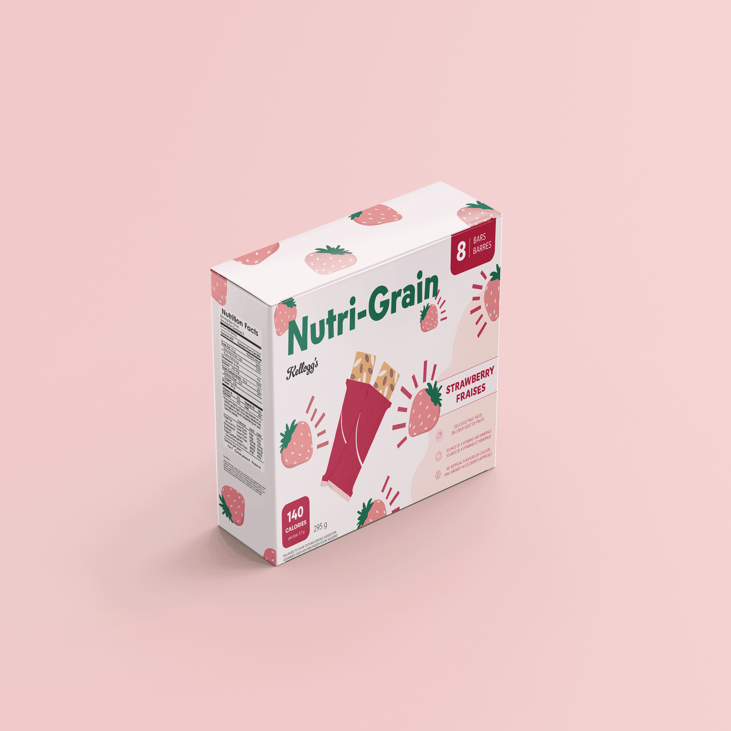
Through the rebranding of Kellogg's NutriGrain, the design presents illustration as an asset in reviving a renewed youthful and modern appearance that successfully competes with current similar snack manufacturers. By omitting its previous earthy colour scheme and replacing it with vibrant pastel hues, it aids in producing an eye-catching and distinct design language that can be recognized across shelves.
Whilst the illustrations communicate the flavour of each snack package, the fluid and organic shapes also contribute to expressing a playful and friendly tone that readily invites consumers to explore the product. The packaging no longer serves a merely functional purpose but also becomes an experience that can be appreciated for its aesthetic value.